About This Design
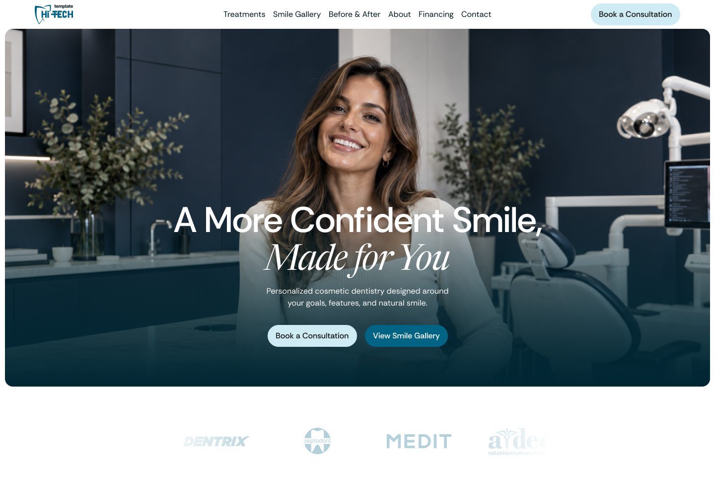
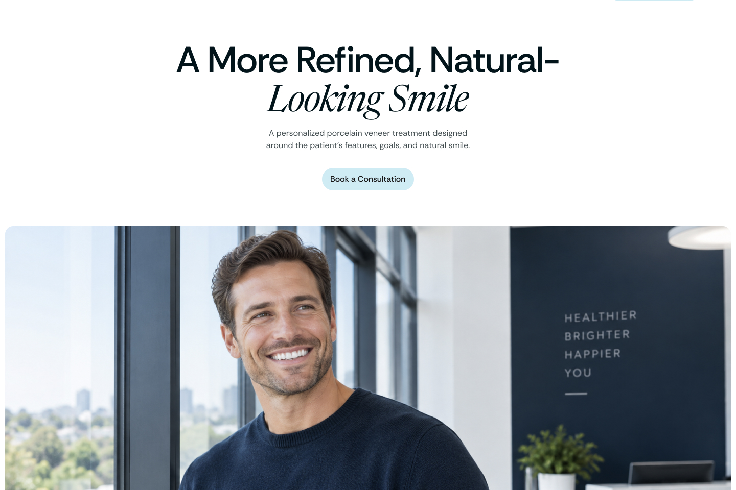
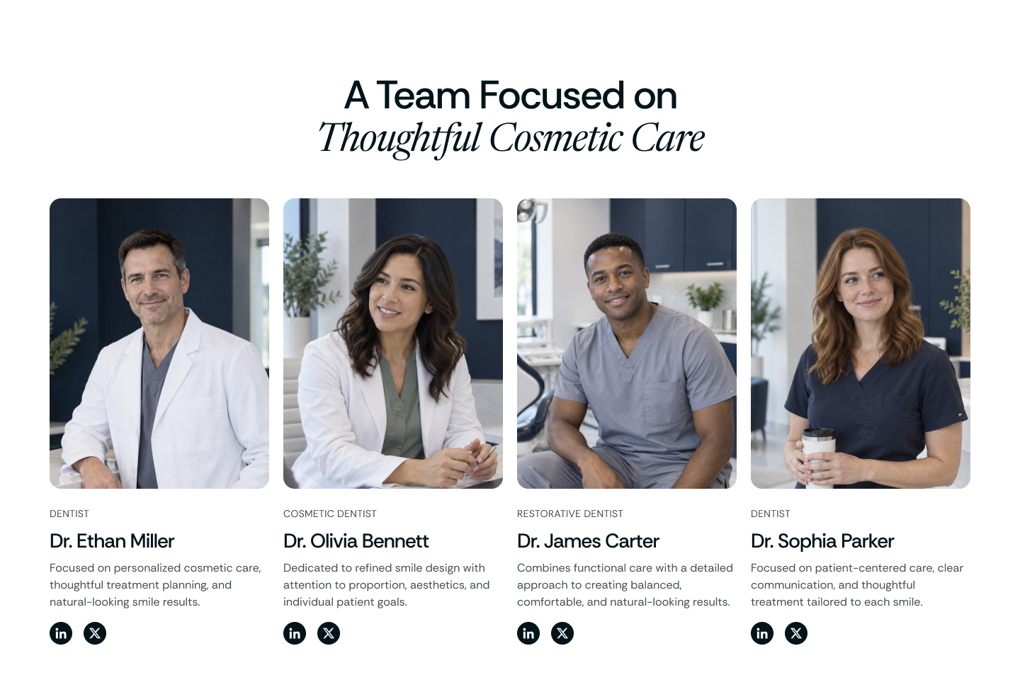
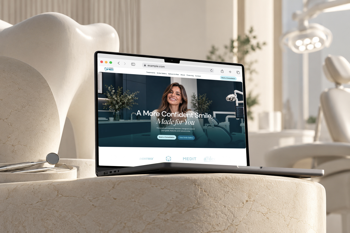
Sorelle uses an editorial-inspired visual language that blends clean sans-serif typography with elegant italic serif accents. The layout relies on generous white space, pale blue panels, deep navy imagery, and restrained teal details to create a consistent clinical aesthetic. Pages are structured around treatment categories, patient transformations, detailed case studies, team profiles, testimonials, financing information, and educational FAQs. Large photography keeps patients, clinicians, and treatment results central, while structured content sections make complex information easy to scan and position cosmetic dentistry as personalized, considered care.